
The Mayon eruption is easy to read as another dramatic volcano update. However, NASA’s latest satellite image reveals something more precise than spectacle.

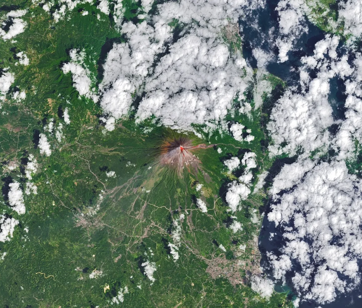
In the Earth Observatory feature, published on March 13, 2026, Mayon’s famously smooth cone looks almost calm at first glance. Then the data changes the picture. Infrared heat signatures trace active lava near the summit and down parts of the volcano’s flanks, turning a beautiful landscape into a live map of risk.
Why the Mayon eruption looks different from space
NASA says the image was captured on February 26, 2026, by the Operational Land Imager on Landsat 8. Instead of showing only a natural-color view, the agency layered in infrared information so the hottest zones would stand out more clearly. That choice matters. It helps readers see the eruption not just as a distant event, but as a measurable process already moving across the mountain. Just as importantly, the image shows how farmland and settled areas sit below an active volcano that is still producing lava, rockfalls, and ash-related hazards.
Mayon rises on Luzon in the Philippines near the Albay and Lagonoy gulfs, and NASA describes it as the country’s most active volcano. Historical records cited by NASA indicate that it has erupted 65 times in the past 5,000 years. This latest eruptive episode began in January 2026. According to both NASA and the Smithsonian Global Volcanism Program’s Mayon profile, activity continued through mid-March, with lava effusion, pyroclastic density currents, rockfalls, ash plumes, and elevated seismicity still being reported.
A near-perfect cone, and a very imperfect threat
Part of what makes Mayon so memorable is its shape. It looks almost too symmetrical to be real. Yet that visual elegance can hide how dangerous the volcano is when activity intensifies. NASA reported that the longest pyroclastic flow visible in late February had traveled about 4 kilometers through the Mi-isi Gully on the southeast flank. By mid-March, the Smithsonian summary of PHIVOLCS reporting said Alert Level 3 remained in place and more than 4,000 people were staying in evacuation shelters or with relatives and friends.
That is why the science behind the hazard matters as much as the image itself. The U.S. Geological Survey’s explanation of pyroclastic flows describes them as fast-moving mixtures of hot rock fragments, gas, and ash that can be devastating because of both their heat and speed. In other words, the danger is not abstract. A volcano like Mayon can look strikingly still in a photo while remaining extremely unstable on the ground.
What the gases reveal
NASA’s report adds another important clue: gas output. During the current eruption, sulfur dioxide emissions averaged 2,466 tons per day, and one daily reading reached 7,633 metric tons on March 6. Those numbers matter because they show that the eruption is not only visually active but chemically intense as well. For scientists, satellites help track that activity across time. For everyone else, they offer something rarer: a way to understand how beauty, danger, and data can all exist in the same frame.
In that sense, this is not just a volcano story. It is a reminder that some of Earth’s most iconic landscapes are also the least settled. From orbit, Mayon looks composed. Up close, it is still changing. That contrast is exactly what makes this image worth discovering.
➡️ Explore more Poziwibe Nature stories where science, scale, and the planet’s strangest moments come into focus.

