
Ricardo Bofill’s 1973 housing complex in Calpe still feels strikingly current because La Muralla Roja architecture was designed as a system of movement, color, and controlled disorientation.
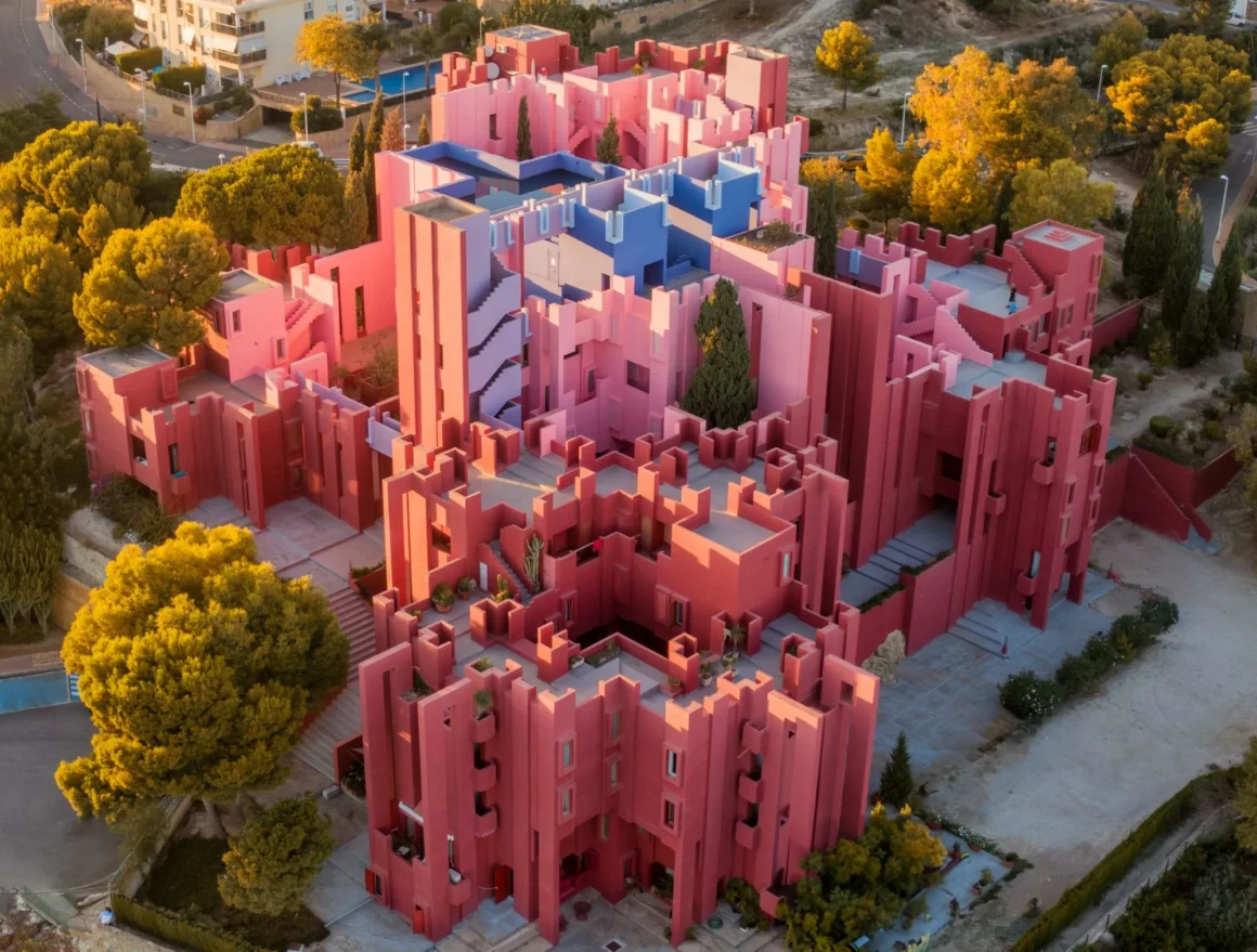
La Muralla Roja architecture still feels unusually modern because it was never shaped as a static image. It was shaped as an experience of movement.
You do not take in this building all at once. You enter it, turn, pause, climb, and briefly lose your sense of direction. Then the logic begins to appear. That is the real design move. What reads online as a photogenic object is, in reality, a residential complex in Calpe, Spain, designed by Ricardo Bofill Taller de Arquitectura and completed in 1973 with clear references to North African kasbah architecture and a tightly controlled modular plan.
What makes La Muralla Roja memorable is not color alone. It is the way the building turns orientation into drama without ever losing control. The disorientation feels emotional, but it never feels accidental.
The building only fully appears when you move through it
Calling La Muralla Roja a maze gets close, but not close enough. A maze sounds loose. This project is far more exact.
Its stairs, bridges, courtyards, landings, and terraces are arranged through a precise geometric system that threads roughly 50 apartments into a sequence of repeated but shifting encounters. The sensation of being lost is engineered.
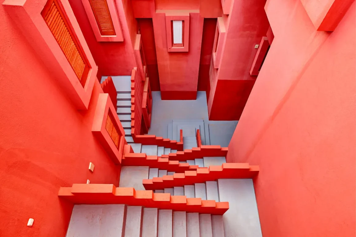
That distinction is what gives the project its force. The stairs do more than connect levels. They keep breaking and rebuilding perspective. The courtyards do more than fill space. They regulate light, pressure, and pause. The roof terraces do more than open toward the Mediterranean. They act like release points after the building’s tighter internal passages.
What La Muralla Roja really designs is not just form. It designs bodily perception.
Color is doing more than visual work
This is the part that gets flattened most easily by Instagram and Pinterest culture. The reds, pinks, blues, and violets are not there simply to make the complex look striking. They help organize the experience of moving through it.


Exterior reds hold their intensity against the landscape, while cooler tones shift the relationship between walls, sky, shadow, and depth. Color here behaves like orientation, not decoration.
That is why the project feels richer in person than it does in a feed. The palette does not just make the structure beautiful. It helps the eye register whether a space is tightening, opening, rising, or dissolving. In weaker coverage, the building becomes “the pink one in Spain.” In stronger readings, it becomes something much more interesting: a controlled navigation system disguised as a dream image.
Built like a system before that language became fashionable
What keeps La Muralla Roja architecture current is that it thinks in systems long before digital design culture made that vocabulary common. Repetition, variation, modular logic, controlled circulation, and spatial sequencing are doing the real work here.
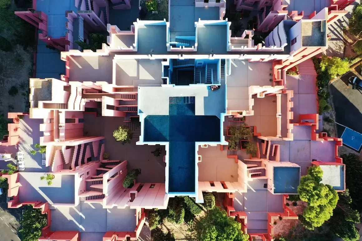
It was built as a rule set, not as a pose. That is why it can feel almost algorithmic now without ever turning cold.
And that may be the most interesting part of the story. We live in a visual culture that keeps rewarding architecture as surface. La Muralla Roja keeps resisting that reduction. The building travels well as an image, but its real intelligence begins where the image stops being enough.
It is not most alive when it is photographed. It is most alive when it is navigated.
➡️ Explore more Lifestyle stories where design feels like discovery, not just decoration.

